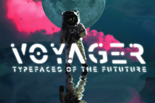
Voyager: A Futuristic Display Font for Sci-Fi Design
When your project needs to feel like it’s launched from a launchpad—not a design studio—Voyager delivers. It’s not just another space-themed font. It’s a carefully crafted display typeface built for impact, legibility, and tonal precision in sci-fi contexts. Its sharp terminals, asymmetric weight distribution, and subtle geometric tension evoke satellite telemetry, retro-futurist interfaces, and deep-space navigation systems—without leaning into cartoonish clichés or dated 80s synthwave tropes.
Why Voyager Stands Out Among Sci-Fi Fonts
Most sci-fi fonts fall into two camps: overly ornate (think glowing glyphs with excessive bevels) or stripped-down monospaced mimics that sacrifice personality for function. Voyager bridges that gap. Its uppercase letters feature confident, angled cuts—like laser-etched hull plating—while lowercase forms retain enough warmth and rhythm to support short headlines, signage, or UI labels without visual fatigue.
What makes it especially useful is its intentional restraint. There are no animated glyphs, no forced “glow” effects baked into the vectors—and that’s by design. Voyager works because it gives you room to add context: pair it with clean sans-serifs for body text, layer it over starfield gradients, or animate individual letters with subtle hover transitions. It’s a foundation—not a finished effect.
Creative Applications Across Real Projects
Designers and creators use Voyager where tone and immediacy matter most:
- Game UI & Title Screens: Indie developers building narrative-driven space adventures use Voyager for mission logs, faction names, and terminal readouts. One creator applied it at 36pt with tight letter-spacing and a 1px white stroke on dark indigo—achieving high contrast without glare.
- Educational Outreach: Planetariums and STEM educators integrate Voyager into exhibit banners and interactive kiosk headers. Its clarity at distance and strong x-height make it readable under varied lighting—even in low-light dome environments.
- Podcast & Video Branding: Sci-fi commentary shows use Voyager for intro cards and thumbnail text. A podcast about exoplanet research paired it with Inter for voiceover captions—creating hierarchy without competing personalities.
- Small Business Identity: A boutique shop selling handmade astrolabes and celestial jewelry uses Voyager for its logo lockup and window decals. They scaled it down to 24pt for business cards—proving it holds up even in compact formats when spacing is adjusted thoughtfully.
Adapting Voyager for Different Audiences and Platforms
Voyager isn’t one-size-fits-all—but it *is* highly adaptable. The key is matching its expressive strength to your audience’s expectations and the medium’s constraints.
For educators and science communicators, prioritize readability over flair. Use Voyager at larger sizes for section headers only; avoid all-caps blocks longer than five words. Pair it with a neutral, highly legible text face like Lato or Source Sans Pro. This keeps credibility intact while still signaling thematic intent.
Marketers and small business owners should test Voyager in context—not just as a standalone logo. Does it render cleanly on mobile email clients? Does it scale well inside Instagram Story templates? One local VR arcade tested Voyager in three weights across six platforms before settling on the Medium weight for outdoor signage and the Bold for digital ads—because lighter weights lost definition on LED walls.
Bloggers and content creators benefit most from using Voyager selectively: as a recurring visual motif rather than a full typography system. Try it for episode titles, quote pull-outs, or chapter dividers in long-form articles about AI ethics or space policy. That kind of repetition builds brand recognition without overwhelming readers.
Practical Tips for Stronger Results
Voyager thrives when supported—not overshadowed. Here’s what works in practice:
- Respect vertical rhythm. Its tall x-height and generous ascenders mean line height matters. Start with 1.3–1.4× the font size for headings, and increase if stacking multiple lines.
- Adjust tracking intentionally. Default spacing leans tight. Loosen it by +20–40 units for large displays; tighten slightly for logos where cohesion is priority.
- Avoid over-layering. Drop shadows, glows, or heavy outlines dilute Voyager’s precision. If you need emphasis, try a subtle stroke (0.5–1px), a contrasting background bar, or strategic negative space instead.
- Test color contrast early. Its sharp geometry reads best against deep, muted backgrounds—navy, charcoal, or deep violet—not pure black. For light mode, use off-whites or warm grays to soften contrast fatigue.
- License for your use case. Voyager includes web, desktop, and app licensing options. If embedding in a customer-facing SaaS dashboard, confirm the license covers dynamic rendering—not just static assets.
Keeping It Original Without Losing Clarity
Originality with Voyager doesn’t mean reinventing the font—it means using it with intention. One educator redesigned her astronomy workshop handouts by applying Voyager only to module titles and key terminology (“exoplanet”, “red shift”, “habitable zone”), then using consistent iconography alongside each term. The result felt cohesive, memorable, and classroom-ready—not gimmicky.
Similarly, a freelance designer working with a startup developing orbital debris-tracking software used Voyager exclusively for data dashboard headers—then added minimalist line illustrations of satellites and orbit paths in the same stroke weight. The font didn’t carry the concept alone; it anchored a unified visual language.
That’s the real strength of Voyager: it invites collaboration with other design elements instead of demanding center stage. When you treat it as a deliberate choice—not a default “space” shortcut—you align form with purpose. And that’s how functional sci-fi design earns trust, not just attention.
Getting Started Thoughtfully
If you’re evaluating Voyager for an upcoming project, start small. Replace one existing headline in a mockup. Test it at three sizes. Try two background colors. See how it behaves next to your current body text. Notice where it adds authority—and where it introduces friction.
You don’t need to overhaul your entire identity to benefit from Voyager. You just need a moment where your audience should feel like they’ve stepped into something precise, forward-looking, and quietly confident. That’s where Voyager earns its place—not as decoration, but as design with direction.